Car and Driver
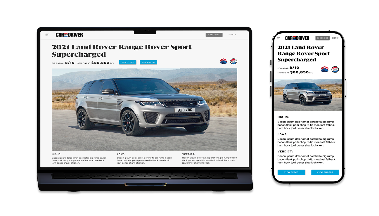
Consumer-oriented project integrating user research, project management, and Low-to-High Fidelity Prototyping in alignment with refreshed magazine branding. Completed within a two-week timeframe, achieving a full-scale global rollout to over 500,000 active users.
Project Details
Product Design
Landon Oliver (me), Sam Conant
Two Weeks
Background | Overview & Role
While users explore the web seeking their ideal vehicle or browsing for the latest automotive innovations, Car and Driver remains a pivotal destination for comprehensive vehicle information. From pricing insights to detailed comfort ratings derived from extensive testing, it serves as a prominent resource catering to diverse automotive interests. During my tenure at Car and Driver, the focus was on aligning the digital platform with the fresh print magazine layout.
In my role as the primary designer at Car and Driver, I led the charge in redesigning the Make & Model page to ensure a cohesive user experience. This involved close collaboration with developers, the magazine design team, and creative directors. Through extensive user testing, I validated the UX workflow to guarantee an intuitive and precise digital experience while upholding consistency with the magazine's design language. The objective was not solely to revamp the digital interface but also to unify the overall design approach, ensuring a seamless transition from print to digital mediums.
Process | Workflow & Exploration
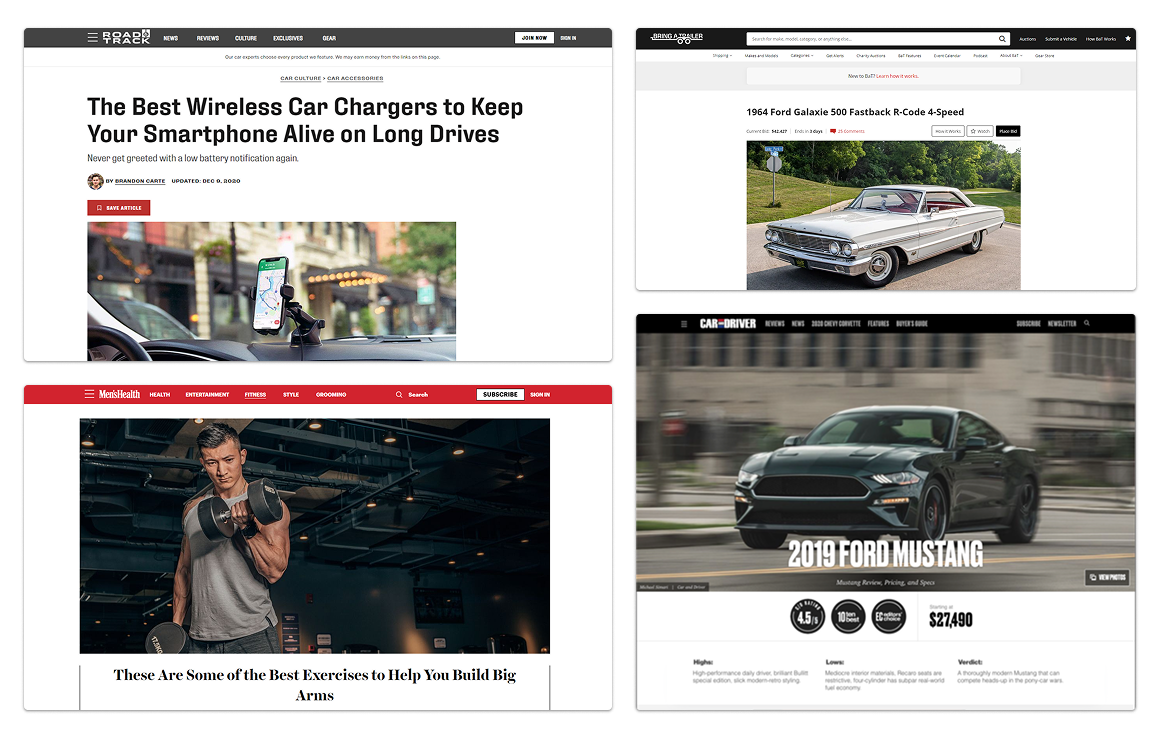
The objective was to craft a fresh iteration of the model page that would resonate with everyday consumers while aligning seamlessly with the updated brand guidelines. To kickstart the process, I embarked on exploration, drawing inspiration from established websites within Hearst Magazines. Platforms like Road and Track, Bring a Trailer, and Mens Health stood out for their distinctive presentation styles. Their use of prominent headers, centered imagery, and engaging interactive elements caught my attention right away.
Assessing our current web layout, I captured screenshots and initiated a user test via usertesting.com. This approach aimed to address any existing issues users might have encountered while navigating the current page. The insights gathered from this user testing process proved invaluable in refining our approach to create an engaging and user-friendly model page experience.
Once I compiled this feedback, I delved into sketching the existing page, mapping out a strategy to craft a design that prioritized user requirements while remaining aligned with our brand guidelines. Transitioning from initial sketches, I ventured into Figma to actualize this vision. This involved integrating pre-existing imagery and components from our library, streamlining the workflow for a more efficient design process.
Using Figma as my design platform enabled a meticulous focus on the project's layout, benefitting from the available components for seamless integration. I began by examining the design layout of the current page, aiming to revamp font styles, buttons, icons, and diverse layout possibilities. This process provided a spectrum of options for brainstorming sessions with the creative director, fostering exploration and ideation to refine the design direction.
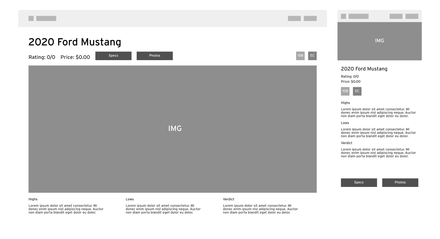
In the journey, my focus centered on harmonizing the presentation of car make and model, pricing details, and iconography in a cohesive manner. I delved into various approaches to segment these elements while ensuring users could swiftly access essential information. Simultaneously, I kept in mind the responsiveness of these designs across mobile and desktop interfaces. Developing multiple wireframes centered on layout, I engaged the development team for feedback, subsequently subjecting them to another round of user testing. This process culminated in a discussion with the creative director, reviewing and incorporating the insights gathered to refine the design direction.
Following the wireframing phase and collecting insights from user tests, the development team, and my creative director, I transitioned into a final design phase. This stage marked the culmination of my process, serving as the bridge to propel the design forward into development.
Solution | Final Product & Thoughts
One of the significant challenges in this project revolved around preserving the page's existing impressive features despite the introduction of a new design. This journey involved multiple iterations, some showing promise while others missed the mark entirely. However, this process allowed for a deeper understanding of the layout's impact on user flow, proving immensely beneficial.
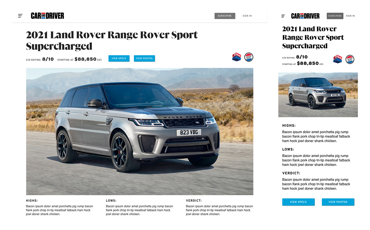
In the final design phase, my focus shifted towards refining the presentation by addressing an issue with text and icons overlaying images. This obstacle prompted me to reconsider the design approach, drawing inspiration from Bring-a-Trailer's header format. Their format encapsulated every crucial element Car and Driver required, including a prominent header, succinct sub-text, strategic button placement, and ample space for editor icons. The image below showcases the culmination of these efforts, representing the ultimate outcome of the design endeavor.
Impact | Consistency & Results
The successful launch of Car and Driver's new magazine, across both print and digital platforms, marked a significant achievement. The continued engagement of over five-hundred thousand active users on the website is truly gratifying, and I'm thrilled to have contributed to such a remarkable endeavor.
Reflecting on this project, a few key takeaways stand out prominently. First and foremost, communication remains pivotal—always and without exception. Collaborating closely with the team, engaging in brainstorming sessions, sketching out ideas, and mapping workflows proved invaluable in making informed decisions throughout. Lastly, and importantly, embracing a sense of enjoyment and enthusiasm while working through the challenges was paramount—a reminder to find joy in the process itself.